How to make card responsive in bootstrap?
June 13, 2022Hi Friends 👋,
Welcome To aGuideHub! ❤️
In this article, we will use some bootstrap classes to design responsive card.
To make card responsive, put .card mx-auto class to create card responsive in bootstrap.
Table of contents
- Includes bootstrap view
- Includes bootstrap library
- Define its class name
Step 1: Includes bootstrap view
To ensure proper rendering and touch zooming for all devices, add the responsive viewport meta tag to your <head>.
<meta name="viewport" content="width=device-width,initial-scale=1,shrink-to-fit=no">Step 2: Includes bootstrap library
First of all, load the Bootstrap framework CSS into the head tag of your webpage.
<!-- Bootstrap CSS -->
  <link rel="stylesheet" href="https://maxcdn.bootstrapcdn.com/bootstrap/4.0.0/css/bootstrap.min.css"
        integrity="sha384-Gn5384xqQ1aoWXA+058RXPxPg6fy4IWvTNh0E263XmFcJlSAwiGgFAW/dAiS6JXm" crossorigin="anonymous">
Step 3: Define its class name
After that, create card responsive with a class name .card mx-auto.
    <div class="card mx-auto" style="width:18rem;">
        <img class="card-img-top" src="image/flower.jpg" alt="Card image cap">

        <div class="card-body">
            <h5 class="card-title">
                aGuideHub            </h5>

            <p class="card-text">"Sed ut perspiciatis unde omnis iste natus error sit voluptatem accusantium doloremque laudantium, totam rem"</p>


            <a href="#" class="btn btn-success">
                Click me
            </a>
        </div>
    </div>
Example.
Let’s look at the following example to understand how it basically works:
<!DOCTYPE html>
<html lang="en">

<head>
    <meta charset="UTF-8">
    <meta name="viewport" content="width=device-width, initial-scale=1.0">

    <title> Responsive card </title>

    <!-- bootstrap linked-->
    <link rel="stylesheet" href="https://maxcdn.bootstrapcdn.com/bootstrap/4.0.0/css/bootstrap.min.css"
        integrity="sha384-Gn5384xqQ1aoWXA+058RXPxPg6fy4IWvTNh0E263XmFcJlSAwiGgFAW/dAiS6JXm" crossorigin="anonymous">
</head>

<body>

    <!-- Card design with bootstrap class mx-auto
		for making it centered in the div-->
    <div class="card mx-auto" style="width:18rem;">
        <img class="card-img-top" src="image/flower.jpg" alt="Card image cap">

        <div class="card-body">
            <h5 class="card-title">
                aGuideHub            </h5>

            <p class="card-text">"Sed ut perspiciatis unde omnis iste natus error sit voluptatem accusantium doloremque laudantium, totam rem"</p>


            <a href="#" class="btn btn-success">
                Click me
            </a>
        </div>
    </div>

    <!--card end here-->
    <script src="https://code.jquery.com/jquery-3.2.1.slim.min.js"
        integrity="sha384-KJ3o2DKtIkvYIK3UENzmM7KCkRr/rE9/Qpg6aAZGJwFDMVNA/GpGFF93hXpG5KkN" crossorigin="anonymous">
        </script>

    <script src="https://cdnjs.cloudflare.com/ajax/libs/popper.js/1.12.9/umd/popper.min.js"
        integrity="sha384-ApNbgh9B+Y1QKtv3Rn7W3mgPxhU9K/ScQsAP7hUibX39j7fakFPskvXusvfa0b4Q" crossorigin="anonymous">
        </script>

    <script src="https://maxcdn.bootstrapcdn.com/bootstrap/4.0.0/js/bootstrap.min.js"
        integrity="sha384-JZR6Spejh4U02d8jOt6vLEHfe/JQGiRRSQQxSfFWpi1MquVdAyjUar5+76PVCmYl" crossorigin="anonymous">
        </script>
</body>

</html>
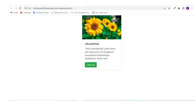
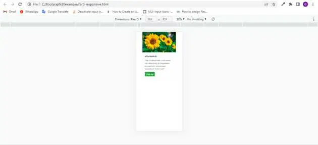
Check the output of the above code example.
when window size is > 576px :
When window size is less than < 576px :
All the best 👍

