How to change mui autocomplete hover color in react js?
January 15, 2023Hi Friends 👋,
Welcome To aGuideHub!
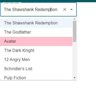
To change mui autocomplete hover color in React js, you will use "&:hover": { backgroundColor: "pink !important" }. It will change mui autocomplete hover color in react js.
Today, I am going to show you, how to change mui autocomplete hover color in react js.
Installation
Install the following packages to use change mui autocomplete hover color in react js.
npm
npm install @mui/material @emotion/react @emotion/styledyarn
yarn add @mui/material @emotion/react @emotion/styledMUI material change mui autocomplete hover color example.
The code below is an example of a Material UI autocomplete that is hover color. You have to import @mui material autocomplete and using this code "&:hover": { backgroundColor: "pink !important" }. It will change mui autocomplete hover color.
App.js
 import * as React from 'react';
 import TextField from '@mui/material/TextField';
 import Autocomplete from '@mui/material/Autocomplete';
import { makeStyles } from "@mui/styles";

const useStyles = makeStyles({
  option: {
    "&:hover": {
      backgroundColor: "pink !important"
    }
  }
});

export default function App() {
  const styles = useStyles();

  return (
    <Autocomplete
      id="combo-box-demo"
      options={top100Films}
      classes={{
        option: styles.option
      }}
      debug
      getOptionLabel={(option) => option.title}
      style={{ width: 300 }}
      renderOption={(props, option) => {
        const { title, color } = option;
        return (
          <span {...props} style={{ backgroundColor: color }}>
            {title}
          </span>
        );
      }}
      renderInput={(params) => {
        return (
          <TextField
            {...params}
            label="Combo box"
            variant="outlined"
            fullWidth
          />
        );
      }}
    />
  );
}

const top100Films = [
  { title: "The Shawshank Redemption", year: 1994,  },
  { title: "The Godfather", year: 1972,  },
  { title: "Avatar", year: 2010,  },
  { title: 'The Dark Knight', year: 2008 },
  { title: '12 Angry Men', year: 1957 },
  { title: "Schindler's List", year: 1993 },
  { title: 'Pulp Fiction', year: 1994 },
  {
    title: 'The Lord of the Rings: The Return of the King',
    year: 2003,
  },
  { title: 'The Good, the Bad and the Ugly', year: 1966 },
  { title: 'Fight Club', year: 1999 },
  {
    title: 'The Lord of the Rings: The Fellowship of the Ring',
    year: 2001,
  },
  {
    title: 'Star Wars: Episode V - The Empire Strikes Back',
    year: 1980,
  },
  { title: 'Forrest Gump', year: 1994 },
  { title: 'Inception', year: 2010 },
  {
    title: 'The Lord of the Rings: The Two Towers',
    year: 2002,
  },
];
In the above code example, I have used the @mui/material component and changed mui autocomplete hover color in react js.
Check the output of the above code example.
All the best 👍
