How to change padding of mui dialog actions in react js?
August 27, 2023Hi Friends 👋,
Welcome To aGuideHub!
To change padding of mui dialog actions in react js, you can set padding: 60px; in .MuiDialogActions-root. it will change padding of mui dialog actions in React JS.
Today, I am going to show you, How to change padding of mui dialog actions in react js
Installation
Install the following packages to use mui dialog in react js.
npm
npm install @mui/material @emotion/react @emotion/styledyarn
yarn add @mui/material @emotion/react @emotion/styledTable of contents
- Install MUI and create a new React app.
- Import Material-UI dialog.
- Use the dialog Component
Step 1: Install MUI and create a new React app.
First you have to install the React project. You should use create-react-app command to create a new React project.
npx create-react-app my-app
cd my-app
npm start
Step 2: Import Material-UI dialog.
After installing MUI, you have to import your React component. To do this, add the following line to the top of your component file.
import React, { useState } from "react";
import PaddingActions from "./paddingActions";
import "./styles.css";
import React from "react";
import Dialog from "@mui/material/Dialog";
import DialogActions from "@mui/material/DialogActions";
import DialogContent from "@mui/material/DialogContent";
import DialogContentText from "@mui/material/DialogContentText";
import DialogTitle from "@mui/material/DialogTitle";
import Button from "@mui/material/Button";
import IconButton from "@mui/material/IconButton";
import CloseIcon from "@mui/icons-material/Close";
Step 3: Use the dialog Component.
You can use the dialog component in your react js. For example, A Dialog is a type of modal window that appears in front of app content to provide critical information or ask for a decision. Dialogs disable all app functionality when they appear, and remain on screen until confirmed, dismissed, or a required action has been taken. You can use <Dialog> component make mui dialog button in react js.
<Dialog open={open} onClose={onClose} maxWidth="sm" fullWidth>
      <DialogTitle>
        Dialog Title
        <IconButton
          edge="end"
          color="inherit"
          onClick={onClose}
          aria-label="close"
          sx={{
            position: "absolute",
            right: 8,
            top: 8
          }}
        >
          <CloseIcon />
        </IconButton>
      </DialogTitle>
      <DialogContent>
        <DialogContentText>Dialog content goes here.</DialogContentText>
      </DialogContent>
      <DialogActions sx={{ justifyContent: "flex-start" }}>
        <Button variant="contained" onClick={onClose}>
          Cancel
        </Button>
        <Button variant="contained" color="primary">
          Save
        </Button>
      </DialogActions>
    </Dialog>
MUI material change padding of mui dialog actions example.
The below code is an example, you need to import dialog Component. Then, you can create a dialog and you can set padding: 60px; in .MuiDialogActions-root. Then it will change padding of mui dialog actions in react js.
App.js
import React, { useState } from "react";
import PaddingActions from "./paddingActions";
import "./styles.css";

const App = () => {
  const [open, setOpen] = useState(false);

  const handleOpen = () => {
    setOpen(true);
  };

  const handleClose = () => {
    setOpen(false);
  };

  return (
    <div>
      <button onClick={handleOpen}>Open Dialog</button>
      <PaddingActions open={open} onClose={handleClose} />
    </div>
  );
};

export default App;
PaddingActions.js
import React from "react";
import Dialog from "@mui/material/Dialog";
import DialogActions from "@mui/material/DialogActions";
import DialogContent from "@mui/material/DialogContent";
import DialogContentText from "@mui/material/DialogContentText";
import DialogTitle from "@mui/material/DialogTitle";
import Button from "@mui/material/Button";
import IconButton from "@mui/material/IconButton";
import CloseIcon from "@mui/icons-material/Close";

const paddingActions = ({ open, onClose }) => {
  return (
    <Dialog open={open} onClose={onClose} maxWidth="sm" fullWidth>
      <DialogTitle>
        Dialog Title
        <IconButton
          edge="end"
          color="inherit"
          onClick={onClose}
          aria-label="close"
          sx={{
            position: "absolute",
            right: 8,
            top: 8
          }}
        >
          <CloseIcon />
        </IconButton>
      </DialogTitle>
      <DialogContent>
        <DialogContentText>Dialog content goes here.</DialogContentText>
      </DialogContent>
      <DialogActions sx={{ justifyContent: "flex-start" }}>
        <Button variant="contained" onClick={onClose}>
          Cancel
        </Button>
        <Button variant="contained" color="primary">
          Save
        </Button>
      </DialogActions>
    </Dialog>
  );
};

export default paddingActions;
App.css
.MuiDialogActions-root {
  padding: 60px;
}
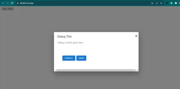
In the above code example, I have used the @mui/material component and changed padding of mui dialog actions in react js.
Check the output of the above code example.
Here, we are provided code sandbox links for the above program change padding of mui dialog actions in react js. Then you can use whenever you want and do the changes as per your requirements.
All the best 👍
