How to change size of mui circular progress in react js?
October 12, 2023Hi Friends 👋,
Welcome To aGuideHub!
To change size of mui circular progress in react js, you can use customStyle and set width: '100px', height: '100px', in progress. it will change size of mui circular progress in React JS.
Today, I am going to show you, How to change size of mui circular progress in react js
Installation
Install the following packages to use mui progress in react js.
npm
npm install @mui/material @emotion/react @emotion/styledyarn
yarn add @mui/material @emotion/react @emotion/styledTable of contents
- Install MUI and create a new React app.
- Import Material-UI progress.
- Use the progress Component
Step 1: Install MUI and create a new React app.
First you have to install the React project. You should use create-react-app command to create a new React project.
npx create-react-app my-app
cd my-app
npm start
Step 2: Import Material-UI progress.
After installing MUI, you have to import your React component. To do this, add the following line to the top of your component file.
import React from 'react';
import CircularProgress from '@material-ui/core/CircularProgress';
Step 3: Use the progress Component.
Progress indicators inform users about the status of ongoing processes, such as loading an app, submitting a form, or saving updates.
<div>
  <CircularProgress style={customStyle} />
</div>
MUI material change size of mui circular progress example.
The below code is an example, you need to import progress Component. Then, you can use customStyle and set width: '100px', height: '100px', in progress. Then it will change size of mui circular progress in react js.
App.js
import React from 'react';
import CircularProgress from '@material-ui/core/CircularProgress';

const MyComponent = () => {
  const customStyle = {
    width: '100px', // Adjust to your desired width
    height: '100px', // Adjust to your desired height
  };

  return (
    <div>
      <CircularProgress style={customStyle} />
    </div>
  );
}

export default MyComponent;
In the above code example, I have used the @mui/material component and change size of mui circular progress in react js.
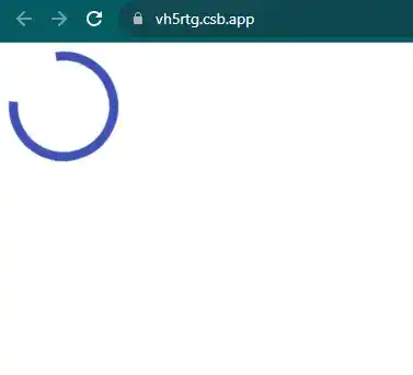
Check the output of the above code example.
Here, we are provided code sandbox links for the above program change size of mui circular progress in react js. Then you can use whenever you want and do the changes as per your requirements.
All the best 👍
