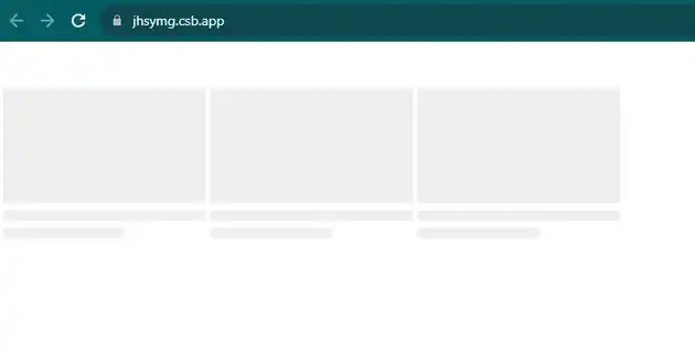
How to make mui skeleton for grid in react js?
October 22, 2023Hi Friends 👋,
Welcome To aGuideHub!
To make mui skeleton for grid in react js, you can use <Grid container wrap="nowrap">. it will make mui skeleton for grid in React JS.
Today, I am going to show you, How to make mui skeleton for grid in react js
Installation
Install the following packages to use mui skeleton in react js.
npm
npm install @mui/material @emotion/react @emotion/styledyarn
yarn add @mui/material @emotion/react @emotion/styledTable of contents
- Install MUI and create a new React app.
- Import Material-UI skeleton.
- Use the skeleton Component
Step 1: Install MUI and create a new React app.
First you have to install the React project. You should use create-react-app command to create a new React project.
npx create-react-app my-app
cd my-app
npm start
Step 2: Import Material-UI skeleton.
After installing MUI, you have to import your React component. To do this, add the following line to the top of your component file.
import * as React from "react";
import PropTypes from "prop-types";
import Grid from "@mui/material/Grid";
import Box from "@mui/material/Box";
import Typography from "@mui/material/Typography";
import Skeleton from "@mui/material/Skeleton";
Step 3: Use the skeleton Component.
A skeleton screen is an animated placeholder that simulates the layout of a website while data is being loaded. Define a functional component called media that takes the loading prop. This component is responsible for rendering a grid of media items, which can be either actual content or a skeleton loader.
<Grid container wrap="nowrap">
      {(loading ? Array.from(new Array(3)) : data).map((item, index) => (
        <Box key={index} sx={{ width: 210, marginRight: 0.5, my: 5 }}>
          {item ? (
            <img
              style={{ width: 210, height: 118 }}
              alt={item.title}
              src={item.src}
            />
          ) : (
            <Skeleton variant="rectangular" width={210} height={118} />
          )}

          {item ? (
            <Box sx={{ pr: 2 }}>
              <Typography gutterBottom variant="body2">
                {item.title}
              </Typography>
              <Typography
                display="block"
                variant="caption"
                color="text.secondary"
              >
                {item.channel}
              </Typography>
              <Typography variant="caption" color="text.secondary">
                {`${item.views} • ${item.createdAt}`}
              </Typography>
            </Box>
          ) : (
            <Box sx={{ pt: 0.5 }}>
              <Skeleton />
              <Skeleton width="60%" />
            </Box>
          )}
        </Box>
  ))}
</Grid>
MUI material make mui skeleton for grid example.
The below code is an example, you need to import skeleton Component. Then, you can use <Grid container wrap="nowrap"> on skeleton. Then it will make mui skeleton for grid in react js.
App.js
import * as React from "react";
import PropTypes from "prop-types";
import Grid from "@mui/material/Grid";
import Box from "@mui/material/Box";
import Typography from "@mui/material/Typography";
import Skeleton from "@mui/material/Skeleton";

const data = [];

function Media(props) {
  const { loading = false } = props;

  return (
    <Grid container wrap="nowrap">
      {(loading ? Array.from(new Array(3)) : data).map((item, index) => (
        <Box key={index} sx={{ width: 210, marginRight: 0.5, my: 5 }}>
          {item ? (
            <img
              style={{ width: 210, height: 118 }}
              alt={item.title}
              src={item.src}
            />
          ) : (
            <Skeleton variant="rectangular" width={210} height={118} />
          )}

          {item ? (
            <Box sx={{ pr: 2 }}>
              <Typography gutterBottom variant="body2">
                {item.title}
              </Typography>
              <Typography
                display="block"
                variant="caption"
                color="text.secondary"
              >
                {item.channel}
              </Typography>
              <Typography variant="caption" color="text.secondary">
                {`${item.views} • ${item.createdAt}`}
              </Typography>
            </Box>
          ) : (
            <Box sx={{ pt: 0.5 }}>
              <Skeleton />
              <Skeleton width="60%" />
            </Box>
          )}
        </Box>
      ))}
    </Grid>
  );
}

Media.propTypes = {
  loading: PropTypes.bool
};

export default function YouTube() {
  return (
    <Box sx={{ overflow: "hidden" }}>
      <Media loading />
      <Media />
    </Box>
  );
}
In the above code example, I have used the @mui/material component and make mui skeleton for grid in react js.
Here, we are provided code sandbox links for the above program make mui skeleton for grid in react js. Then you can use whenever you want and do the changes as per your requirements.
All the best 👍
