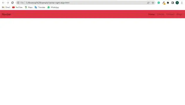
Bootstrap navbar right align example
May 13, 2022Hi Friends 👋,
Welcome To aGuideHub! ❤️
Today, I am going to show you. how to create navbar right align in bootstrap with code example.
the Bootstrap 5 navbar components are aligned to the left. Here, we will learn to align items to the right.
Table of contents
- Includes bootstrap view
- Includes bootstrap library
- Define its class name
This article will guide you to adding navbar examples in Bootstrap with example.
Step 1: Includes bootstrap view
To ensure proper rendering and touch zooming for all devices, add the responsive viewport meta tag to your <head>.
<meta name="viewport" content="width=device-width, initial-scale=1">Step 2: Includes bootstrap library
First of all, load the Bootstrap framework CSS into the head tag of your webpage.
<!-- Bootstrap CSS -->

    <link href="https://cdn.jsdelivr.net/npm/[email protected]/dist/css/bootstrap.min.css" rel="stylesheet">
    <script src="https://cdn.jsdelivr.net/npm/@popperjs/[email protected]/dist/umd/popper.min.js" integrity="sha384-IQsoLXl5PILFhosVNubq5LC7Qb9DXgDA9i+tQ8Zj3iwWAwPtgFTxbJ8NT4GN1R8p" crossorigin="anonymous"></script>
    <script src="https://cdn.jsdelivr.net/npm/[email protected]/dist/js/bootstrap.min.js" integrity="sha384-Atwg2Pkwv9vp0ygtn1JAojH0nYbwNJLPhwyoVbhoPwBhjQPR5VtM2+xf0Uwh9KtT" crossorigin="anonymous"></script>
Step 3: Define its class name
Here is an example, to align items to the right within the navbar. Here, we have used the flex alignment class to do so.
    <nav class="navbar navbar-expand-sm navbar-light bg-danger">
        <div class="container-fluid ">
            <a class="navbar-brand " href="#">Navbar</a>
            <button class="navbar-toggler" type="button" data-bs-toggle="collapse" data-bs-target="#navbarSupportedContent" aria-controls="navbarSupportedContent" aria-expanded="false" aria-label="Toggle navigation">
		  <span class="navbar-toggler-icon"></span>
		</button>
            <div class="collapse navbar-collapse justify-content-end" id="navbarSupportedContent">
                <ul class="navbar-nav ">
                    <li class="nav-item">
                        <a class="nav-link active" aria-current="page" href="#">Home</a>
                    </li>
                    <li class="nav-item">
                        <a class="nav-link" href="#">Course</a>
                    </li>
                    <li class="nav-item">
                        <a class="nav-link" href="#">Contact</a>
                    </li>
                    <li class="nav-item">
                        <a class="nav-link" href="#">Blogs</a>
                    </li>
                </ul>
            </div>
        </div>
    </nav>
Example.
Let’s look at the following example to understand how it basically works:
<!DOCTYPE html>
<html lang="en">

<head>
    <title>Bootstrap </title>
    <meta charset="utf-8">
    <meta name="viewport" content="width=device-width, initial-scale=1">
    <link href="https://cdn.jsdelivr.net/npm/[email protected]/dist/css/bootstrap.min.css" rel="stylesheet">
    <script src="https://cdn.jsdelivr.net/npm/@popperjs/[email protected]/dist/umd/popper.min.js" integrity="sha384-IQsoLXl5PILFhosVNubq5LC7Qb9DXgDA9i+tQ8Zj3iwWAwPtgFTxbJ8NT4GN1R8p" crossorigin="anonymous"></script>
    <script src="https://cdn.jsdelivr.net/npm/[email protected]/dist/js/bootstrap.min.js" integrity="sha384-Atwg2Pkwv9vp0ygtn1JAojH0nYbwNJLPhwyoVbhoPwBhjQPR5VtM2+xf0Uwh9KtT" crossorigin="anonymous"></script>
</head>

<body>
    <nav class="navbar navbar-expand-sm navbar-light bg-danger">
        <div class="container-fluid ">
            <a class="navbar-brand " href="#">Navbar</a>
            <button class="navbar-toggler" type="button" data-bs-toggle="collapse" data-bs-target="#navbarSupportedContent" aria-controls="navbarSupportedContent" aria-expanded="false" aria-label="Toggle navigation">
		  <span class="navbar-toggler-icon"></span>
		</button>
            <div class="collapse navbar-collapse justify-content-end" id="navbarSupportedContent">
                <ul class="navbar-nav ">
                    <li class="nav-item">
                        <a class="nav-link active" aria-current="page" href="#">Home</a>
                    </li>
                    <li class="nav-item">
                        <a class="nav-link" href="#">Course</a>
                    </li>
                    <li class="nav-item">
                        <a class="nav-link" href="#">Contact</a>
                    </li>
                    <li class="nav-item">
                        <a class="nav-link" href="#">Blogs</a>
                    </li>
                </ul>
            </div>
        </div>
    </nav>
</body>

</html>
Check the output of the above code example.
Here, we have used the flex utility and margin utility to align the navbar items to the right. Here we cannot use the float class as the navbar is built with flexbox and float does not work with flexbox. For Bootstrap 4 the ms-auto is replaced with ml-auto.
All the best 👍
