How to give color to button in bootstrap?
June 10, 2022Hi Friends 👋,
Welcome To aGuideHub! ❤️
In this tutorial, we will learn how to give color to button in bootstrap.
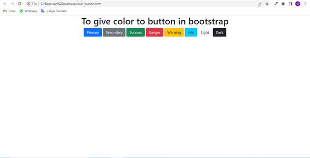
To give color to button, put .btn btn-primary class to change the color of the button.
The buttons are a very useful component in the webpage. It is widely used in webpages to toggle items, navigate between pages, etc. Bootstrap 5 provides various classes to customize the buttons. Bootstrap provides various colored buttons each attached with some semantic meaning.
Table of contents
- Includes bootstrap view
- Includes bootstrap library
- Define its class name
Step 1: Includes bootstrap view
To ensure proper rendering and touch zooming for all devices, add the responsive viewport meta tag to your <head>.
<meta name="viewport" content="width=device-width, initial-scale=1">Step 2: Includes bootstrap library
First of all, load the Bootstrap framework CSS into the head tag of your webpage.
<!-- Bootstrap CSS -->
<link href="https://cdn.jsdelivr.net/npm/[email protected]/dist/css/bootstrap.min.css" rel="stylesheet"integrity="sha384-EVSTQN3azprG1Anm3QDgpJLIm9Nao0Yz1ztcQTwFspd3yD65VohhpuuCOmLASjC" crossorigin="anonymous">
Step 3: Define its class name
Here we will use the html tag button to create a button.
       <h1>To give color to button in bootstrap</h1>
    <button type="button" class="btn btn-primary">Primary</button>
    <button type="button" class="btn btn-secondary">Secondary</button>
    <button type="button" class="btn btn-success">Success</button>
    <button type="button" class="btn btn-danger">Danger</button>
    <button type="button" class="btn btn-warning">Warning</button>
    <button type="button" class="btn btn-info">Info</button>
    <button type="button" class="btn btn-light">Light</button>
    <button type="button" class="btn btn-dark">Dark</button>
Example.
Let’s look at the following example to understand how it basically works:
<!DOCTYPE html>
<html lang="en">

<head>
    <title>Bootstrap </title>
    <meta charset="utf-8">
    <meta name="viewport" content="width=device-width, initial-scale=1">
    <link href="https://cdn.jsdelivr.net/npm/[email protected]/dist/css/bootstrap.min.css" rel="stylesheet">
    <script src="https://cdn.jsdelivr.net/npm/@popperjs/[email protected]/dist/umd/popper.min.js"
        integrity="sha384-IQsoLXl5PILFhosVNubq5LC7Qb9DXgDA9i+tQ8Zj3iwWAwPtgFTxbJ8NT4GN1R8p"
        crossorigin="anonymous"></script>
    <script src="https://cdn.jsdelivr.net/npm/[email protected]/dist/js/bootstrap.min.js"
        integrity="sha384-Atwg2Pkwv9vp0ygtn1JAojH0nYbwNJLPhwyoVbhoPwBhjQPR5VtM2+xf0Uwh9KtT"
        crossorigin="anonymous"></script>
</head>

<body class="text-center">
    <h1>To give color to button in bootstrap</h1>
    <button type="button" class="btn btn-primary">Primary</button>
    <button type="button" class="btn btn-secondary">Secondary</button>
    <button type="button" class="btn btn-success">Success</button>
    <button type="button" class="btn btn-danger">Danger</button>
    <button type="button" class="btn btn-warning">Warning</button>
    <button type="button" class="btn btn-info">Info</button>
    <button type="button" class="btn btn-light">Light</button>
    <button type="button" class="btn btn-dark">Dark</button>

</body>

</html>
Check the output of the above code example.
All the best 👍
