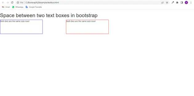
how to give space between two text boxes in bootstrap?
June 02, 2022Hi Friends 👋,
Welcome To aGuideHub! ❤️
In this tutorial, we will learn how to give space between two text boxes in bootstrap.
To give space between two text boxes, put .col-md-* class to create space in two text boxes.
Table of contents
- Includes bootstrap view
- Includes bootstrap library
- Includes css in html page
- Define its class name
Step 1: Includes bootstrap view
To ensure proper rendering and touch zooming for all devices, add the responsive viewport meta tag to your <head>.
<meta name="viewport" content="width=device-width, initial-scale=1, shrink-to-fit=no">Step 2: Includes bootstrap library
First of all, load the Bootstrap framework CSS into the head tag of your webpage.
<!-- Bootstrap CSS -->
<link rel="stylesheet" href="https://maxcdn.bootstrapcdn.com/bootstrap/4.0.0/css/bootstrap.min.css"
    integrity="sha384-Gn5384xqQ1aoWXA+058RXPxPg6fy4IWvTNh0E263XmFcJlSAwiGgFAW/dAiS6JXm" crossorigin="anonymous">
<link href="https://maxcdn.bootstrapcdn.com/bootstrap/3.3.7/css/bootstrap.min.css" rel="stylesheet" />
<link rel="stylesheet" href="https://use.fontawesome.com/releases/v5.4.1/css/all.css"
    integrity="sha384-5sAR7xN1Nv6T6+dT2mhtzEpVJvfS3NScPQTrOxhwjIuvcA67KV2R5Jz6kr4abQsz" crossorigin="anonymous">
Step 3: Includes css in html page
Here we are using in css class to create two text boxes.
        .div1 {
            width: 300px;
            height: 100px;
            border: 1px solid blue;
            box-sizing: border-box;
        }

        .div2 {
            width: 300px;
            height: 100px;
            border: 1px solid red;
            box-sizing: border-box;
        }
Step 4: Define its class name
After that, create the add space between two text boxes with a class name .col-md-*.
    <h1>Space between two text boxes in bootstrap</h1>
    <div class="row">
        <div class="col-md-4">
            <div class="div1">Both divs are the same size now!</div>
        </div>
        <div class="col-md-4">
            <div class="div2">Both divs are the same size now!</div>
        </div>
    </div>
Example.
Let’s look at the following example to understand how it basically works:
<!DOCTYPE html>
<html>
<!-- Required meta tags -->
<meta charset="utf-8">
<meta name="viewport" content="width=device-width,initial-scale=1, shrink-to-fit=no">

<!-- Bootstrap CSS -->
<link rel="stylesheet" href="https://maxcdn.bootstrapcdn.com/bootstrap/4.0.0/css/bootstrap.min.css"
    integrity="sha384-Gn5384xqQ1aoWXA+058RXPxPg6fy4IWvTNh0E263XmFcJlSAwiGgFAW/dAiS6JXm" crossorigin="anonymous">
<link href="https://maxcdn.bootstrapcdn.com/bootstrap/3.3.7/css/bootstrap.min.css" rel="stylesheet" />
<link rel="stylesheet" href="https://use.fontawesome.com/releases/v5.4.1/css/all.css"
    integrity="sha384-5sAR7xN1Nv6T6+dT2mhtzEpVJvfS3NScPQTrOxhwjIuvcA67KV2R5Jz6kr4abQsz" crossorigin="anonymous">

<head>
    <style>
        .div1 {
            width: 300px;
            height: 100px;
            border: 1px solid blue;
            box-sizing: border-box;
        }

        .div2 {
            width: 300px;
            height: 100px;
            border: 1px solid red;
            box-sizing: border-box;
        }
    </style>
</head>
<body>
    <h1>Space between two text boxes in bootstrap</h1>
    <div class="row">
        <div class="col-md-4">
            <div class="div1">Both divs are the same size now!</div>
        </div>
        <div class="col-md-4">
            <div class="div2">Both divs are the same size now!</div>
        </div>
    </div>
</body>
</html>
Check the output of the above code example.
All the best 👍
