How to make table responsive in bootstrapb 4?
June 13, 2022Hi Friends 👋,
Welcome To aGuideHub! ❤️
In this tutorial, we will learn how to make table responsive in bootstrap 4.
To make table responsive, put .table-responsive class to create table responsive in bootstrap 4.
To make any table responsive, simply place it inside a <div> element and apply the .table-responsive class to it. You can also specify that the table should have scrollbars based on the width of the viewport (ie breakpoints), using the .table-responsive{-sm|-md|-lg|-xl} classes.
Table of contents
- Includes bootstrap view
- Includes bootstrap library
- Define its class name
Step 1: Includes bootstrap view
To ensure proper rendering and touch zooming for all devices, add the responsive viewport meta tag to your <head>.
<meta name="viewport" content="width=device-width, initial-scale=1">Step 2: Includes bootstrap library
First of all, load the Bootstrap framework CSS into the head tag of your webpage.
<!-- Bootstrap CSS -->
  <link rel="stylesheet" href="https://cdn.jsdelivr.net/npm/[email protected]/dist/css/bootstrap.min.css">
  <script src="https://cdn.jsdelivr.net/npm/[email protected]/dist/jquery.slim.min.js"></script>
  <script src="https://cdn.jsdelivr.net/npm/[email protected]/dist/umd/popper.min.js"></script>
  <script src="https://cdn.jsdelivr.net/npm/[email protected]/dist/js/bootstrap.bundle.min.js"></script>
Step 3: Define its class name
After that, create make table responsive with a class name .table table-responsive.
<div class="container">
  <h2>Responsive Table in Bootstrap - 4</h2>
  <div class="table-responsive">
    <table class="table table-bordered ">
      <thead>
        <tr>
            <th>#</th>
            <th>First Name</th>
            <th>Last Name</th>
            <th>Email</th>
        </tr>
    </thead>
    <tbody>
        <tr>
            <td>1</td>
            <td>Rohan</td>
            <td>Tiwari</td>
            <td>[email protected]</td>
        </tr>
        <tr>
            <td>2</td>
            <td>Sohan</td>
            <td>Pal</td>
            <td>[email protected]</td>
        </tr>
        <tr>
            <td>3</td>
            <td>Rajesh</td>
            <td>Gupta</td>
            <td>[email protected]</td>
        </tr>
    </tbody>
    </table>
  </div>
</div>
Example.
Let’s look at the following example to understand how it basically works:
<!DOCTYPE html>
<html>
<head>
  <meta name="viewport" content="width=device-width, initial-scale=1">
  <link rel="stylesheet" href="https://cdn.jsdelivr.net/npm/[email protected]/dist/css/bootstrap.min.css">
  <script src="https://cdn.jsdelivr.net/npm/[email protected]/dist/jquery.slim.min.js"></script>
  <script src="https://cdn.jsdelivr.net/npm/[email protected]/dist/umd/popper.min.js"></script>
  <script src="https://cdn.jsdelivr.net/npm/[email protected]/dist/js/bootstrap.bundle.min.js"></script>
</head>
<body>

<div class="container">
  <h2>Responsive Table in Bootstrap - 4</h2>
  <div class="table-responsive">
    <table class="table table-bordered ">
      <thead>
        <tr>
            <th>#</th>
            <th>First Name</th>
            <th>Last Name</th>
            <th>Email</th>
        </tr>
    </thead>
    <tbody>
        <tr>
            <td>1</td>
            <td>Rohan</td>
            <td>Tiwari</td>
            <td>[email protected]</td>
        </tr>
        <tr>
            <td>2</td>
            <td>Sohan</td>
            <td>Pal</td>
            <td>[email protected]</td>
        </tr>
        <tr>
            <td>3</td>
            <td>Rajesh</td>
            <td>Gupta</td>
            <td>[email protected]</td>
        </tr>
    </tbody>
    </table>
  </div>
</div>

</body>
</html>
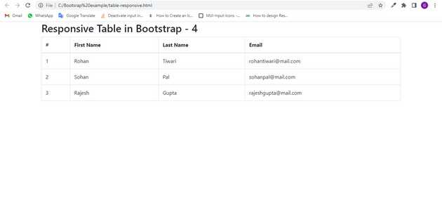
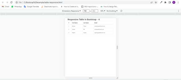
Check the output of the above code example.
when window size is > 576px :
When window size is less than < 576px :
All the best 👍

