How to make text responsive in bootstrap 4?
June 15, 2022Hi Friends 👋,
Welcome To aGuideHub! ❤️
In this article, we will use some bootstrap classes to design text responsive.
To make text responsive, put .font-size: 8vw; class to create text responsive in bootstrap.
You can make text responsive in Bootstrap by using vw units or media queries.
The text size can be set with a vw unit, which means the viewport width.
Viewport is the browser window size. 1vw = 1% of viewport width. If the viewport is 50cm wide, 1vw is 0.5cm.
Resize the browser window to see how the font size scales.
Table of contents
- Includes bootstrap view
- Includes bootstrap library
- Define its class name
Step 1: Includes bootstrap view
To ensure proper rendering and touch zooming for all devices, add the responsive viewport meta tag to your <head>.
<meta name="viewport" content="width=device-width,initial-scale=1,shrink-to-fit=no">Step 2: Includes bootstrap library
First of all, load the Bootstrap framework CSS into the head tag of your webpage.
<!-- Bootstrap CSS -->
    <link rel="stylesheet" href="https://cdn.jsdelivr.net/npm/[email protected]/dist/css/bootstrap.min.css" integrity="sha384-Gn5384xqQ1aoWXA+058RXPxPg6fy4IWvTNh0E263XmFcJlSAwiGgFAW/dAiS6JXm" crossorigin="anonymous">
Step 3: Define its class name
After that, create text responsive with a class name .font-size: 8vw;.
<h1 style="font-size: 8vw;">I am responsive</h1>Example.
Let’s look at the following example to understand how it basically works:
<!doctype html>
<html lang="en">
  <head>
    <!-- Required meta tags -->
    <meta charset="utf-8">
    <meta name="viewport" content="width=device-width, initial-scale=1, shrink-to-fit=no">

    <!-- Bootstrap CSS -->
    <link rel="stylesheet" href="https://cdn.jsdelivr.net/npm/[email protected]/dist/css/bootstrap.min.css" integrity="sha384-Gn5384xqQ1aoWXA+058RXPxPg6fy4IWvTNh0E263XmFcJlSAwiGgFAW/dAiS6JXm" crossorigin="anonymous">

    <title>bootstrap</title>
  </head>
  <body>
    <h1 style="font-size: 8vw;">I am responsive</h1>

    <!-- Optional JavaScript -->
    <!-- jQuery first, then Popper.js, then Bootstrap JS -->
    <script src="https://code.jquery.com/jquery-3.2.1.slim.min.js" integrity="sha384-KJ3o2DKtIkvYIK3UENzmM7KCkRr/rE9/Qpg6aAZGJwFDMVNA/GpGFF93hXpG5KkN" crossorigin="anonymous"></script>
    <script src="https://cdn.jsdelivr.net/npm/[email protected]/dist/umd/popper.min.js" integrity="sha384-ApNbgh9B+Y1QKtv3Rn7W3mgPxhU9K/ScQsAP7hUibX39j7fakFPskvXusvfa0b4Q" crossorigin="anonymous"></script>
    <script src="https://cdn.jsdelivr.net/npm/[email protected]/dist/js/bootstrap.min.js" integrity="sha384-JZR6Spejh4U02d8jOt6vLEHfe/JQGiRRSQQxSfFWpi1MquVdAyjUar5+76PVCmYl" crossorigin="anonymous"></script>
  </body>
</html>
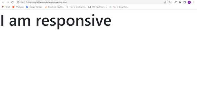
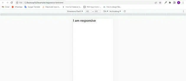
Check the output of the above code example.
when window size is > 576px :
When window size is less than < 576px :
All the best 👍

