Which bootstrap 4 class is used to make images responsive?
May 25, 2022Hi Friends 👋,
Welcome To aGuideHub! ❤️
In this tutorial, we walk through the complete process of creating a used to get a make images responsive.
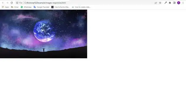
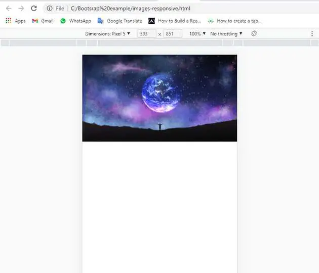
Images in Bootstrap are made responsive with .img-fluid. max-width: 100%; and height: auto; are applied to the image so that it scales with the parent element.
Table of contents
- Includes bootstrap view
- Includes bootstrap library
- Define its class name
This article will guide you to adding contextual classes of table in Bootstrap with example.
Step 1: Includes bootstrap view
To ensure proper rendering and touch zooming for all devices, add the responsive viewport meta tag to your <head>.
<meta name="viewport" content="width=device-width, initial-scale=1">Step 2: Includes bootstrap library
First of all, load the Bootstrap framework CSS into the head tag of your webpage.
<link rel="stylesheet" href="https://cdn.jsdelivr.net/npm/[email protected]/dist/css/bootstrap.min.css"integrity="sha384-Gn5384xqQ1aoWXA+058RXPxPg6fy4IWvTNh0E263XmFcJlSAwiGgFAW/dAiS6JXm" crossorigin="anonymous">Step 3: Included JS bootstrap
Now, load the Bootstrap JavaScript file before closing the body tag and done.
     <script src="https://code.jquery.com/jquery-3.2.1.slim.min.js"
       integrity="sha384-KJ3o2DKtIkvYIK3UENzmM7KCkRr/rE9/Qpg6aAZGJwFDMVNA/GpGFF93hXpG5KkN"
       crossorigin="anonymous"></script>
   <script src="https://cdn.jsdelivr.net/npm/[email protected]/dist/umd/popper.min.js"
       integrity="sha384-ApNbgh9B+Y1QKtv3Rn7W3mgPxhU9K/ScQsAP7hUibX39j7fakFPskvXusvfa0b4Q"
       crossorigin="anonymous"></script>
   <script src="https://cdn.jsdelivr.net/npm/[email protected]/dist/js/bootstrap.min.js"
       integrity="sha384-JZR6Spejh4U02d8jOt6vLEHfe/JQGiRRSQQxSfFWpi1MquVdAyjUar5+76PVCmYl"
       crossorigin="anonymous"></script>
Step 4: Define its class name
Here we will use .img-fluid class to make image responstive.
<img src="image/pngtree.jpg" class="img-fluid" alt="Responsive image">Example.
Let’s look at the following example to understand how it basically works:
<!doctype html>
<html lang="en">

<head>
    <!-- Required meta tags -->
    <meta charset="utf-8">
    <meta name="viewport" content="width=device-width, initial-scale=1, shrink-to-fit=no">

    <!-- Bootstrap CSS -->
    <link rel="stylesheet" href="https://cdn.jsdelivr.net/npm/[email protected]/dist/css/bootstrap.min.css"
        integrity="sha384-Gn5384xqQ1aoWXA+058RXPxPg6fy4IWvTNh0E263XmFcJlSAwiGgFAW/dAiS6JXm" crossorigin="anonymous">

    <title>Bootstrap</title>
</head>

<body>
    <img src="image/pngtree.jpg" class="img-fluid" alt="Responsive image">

    <!-- Optional JavaScript -->
    <!-- jQuery first, then Popper.js, then Bootstrap JS -->
    <script src="https://code.jquery.com/jquery-3.2.1.slim.min.js"
        integrity="sha384-KJ3o2DKtIkvYIK3UENzmM7KCkRr/rE9/Qpg6aAZGJwFDMVNA/GpGFF93hXpG5KkN"
        crossorigin="anonymous"></script>
    <script src="https://cdn.jsdelivr.net/npm/[email protected]/dist/umd/popper.min.js"
        integrity="sha384-ApNbgh9B+Y1QKtv3Rn7W3mgPxhU9K/ScQsAP7hUibX39j7fakFPskvXusvfa0b4Q"
        crossorigin="anonymous"></script>
    <script src="https://cdn.jsdelivr.net/npm/[email protected]/dist/js/bootstrap.min.js"
        integrity="sha384-JZR6Spejh4U02d8jOt6vLEHfe/JQGiRRSQQxSfFWpi1MquVdAyjUar5+76PVCmYl"
        crossorigin="anonymous"></script>
</body>

</html>
Check the output of the above code example.
All the best 👍

