How to make an image responsive in bootstrap?
June 14, 2022Hi Friends 👋,
Welcome To aGuideHub! ❤️
In this article, we will use some bootstrap classes to design responsive image.
To make image responsive, put .img-fluid class to create image responsive in bootstrap.
Images come in all sizes. So do screens. Responsive images automatically adjust to fit the size of the screen.
Create responsive images by adding an .img-fluid class to the <img> tag. The image will then scale nicely to the parent element.
The .img-fluid class applies max-width: 100%; and height: auto; to the image:
Table of contents
- Includes bootstrap view
- Includes bootstrap library
- Define its class name
Step 1: Includes bootstrap view
To ensure proper rendering and touch zooming for all devices, add the responsive viewport meta tag to your <head>.
<meta name="viewport" content="width=device-width, initial-scale=1">Step 2: Includes bootstrap library
First of all, load the Bootstrap framework CSS into the head tag of your webpage.
<!-- Bootstrap CSS -->
    <link href="https://cdn.jsdelivr.net/npm/[email protected]/dist/css/bootstrap.min.css" rel="stylesheet">
    <script src="https://cdn.jsdelivr.net/npm/[email protected]/dist/js/bootstrap.bundle.min.js"></script>
Step 3: Define its class name
After that, create image responsive with a class name .img-fluid.
    <div class="container mt-3">
        <h2>Responsive image</h2>
        <img src="image/water.jpg" class="img-fluid" alt="Responsive image">
    </div>
Example.
Let’s look at the following example to understand how it basically works:
<!DOCTYPE html>
<html lang="en">
<head>
    <title>Bootstrap Example</title>
    <meta charset="utf-8">
    <meta name="viewport" content="width=device-width, initial-scale=1">
    <link href="https://cdn.jsdelivr.net/npm/[email protected]/dist/css/bootstrap.min.css" rel="stylesheet">
    <script src="https://cdn.jsdelivr.net/npm/[email protected]/dist/js/bootstrap.bundle.min.js"></script>
</head>
<body>
    <div class="container mt-3">
        <h2>Responsive image</h2>
        <img src="image/water.jpg" class="img-fluid" alt="Responsive image">
    </div>
</body>
</html>
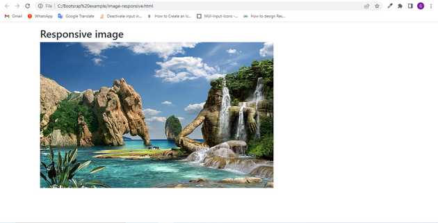
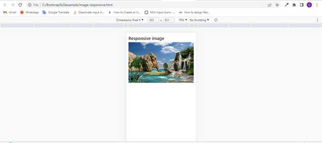
Check the output of the above code example.
When window size is > 576px :
When window size is less than < 576px :
All the best 👍

